Wholistic Care Wellness
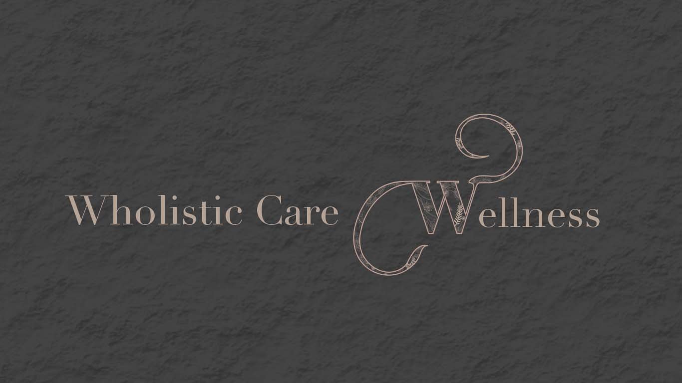
The clients would like the logo and branding that represent themselves as feminisms, warmth welcome and relaxation vibes. So, I created this W with a lot of curve to make it more feminine as I also fill in the “W” with free form line and flowers to create the flawlessness. The earth tone represent the warmth and calmness while the serif typeface gives the classiness to the brand.


